Where The EVs Are – July 2023

EVs by City and County

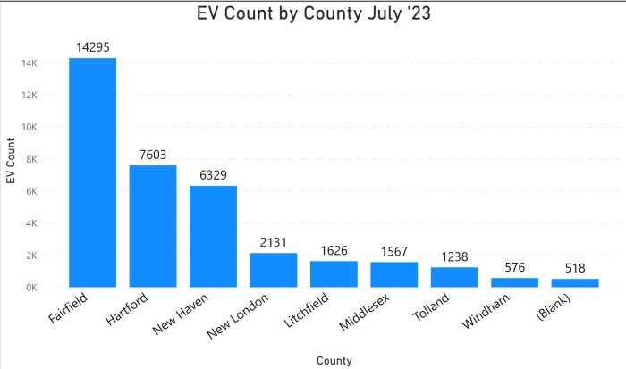
Notes – There are differences every time we receive a file. In this case, the data do not include electric motorcycles and the handful of fuel-cell vehicles, which is different than in the past. Also, importantly for this post, there are 518 vehicles for which there is no geo record. That is why one of the columns in the bar charts is labeled “(Blank).”

Map

In the map at the top of the post, each bubble is a city, the size of the bubble reflects the number of registered EVs in that city, and the shades of color within the bubble depict the proportion of battery electric vehicles (light blue) and plug-in hybrid vehicles (dark blue).
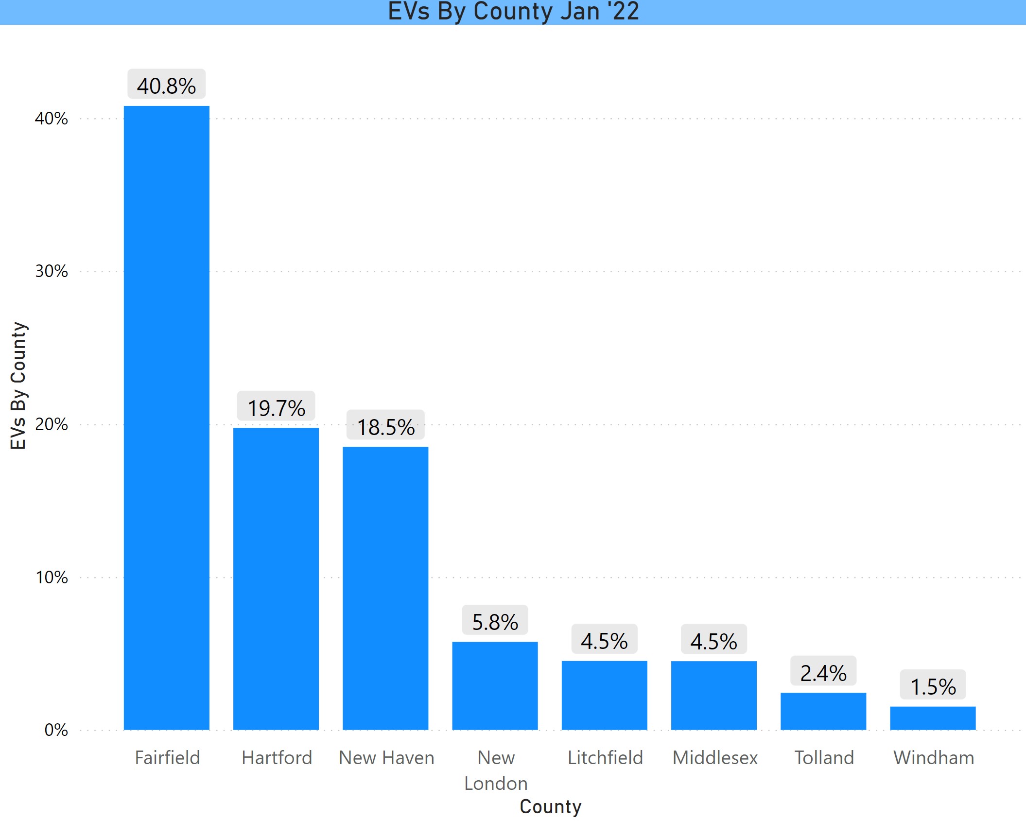
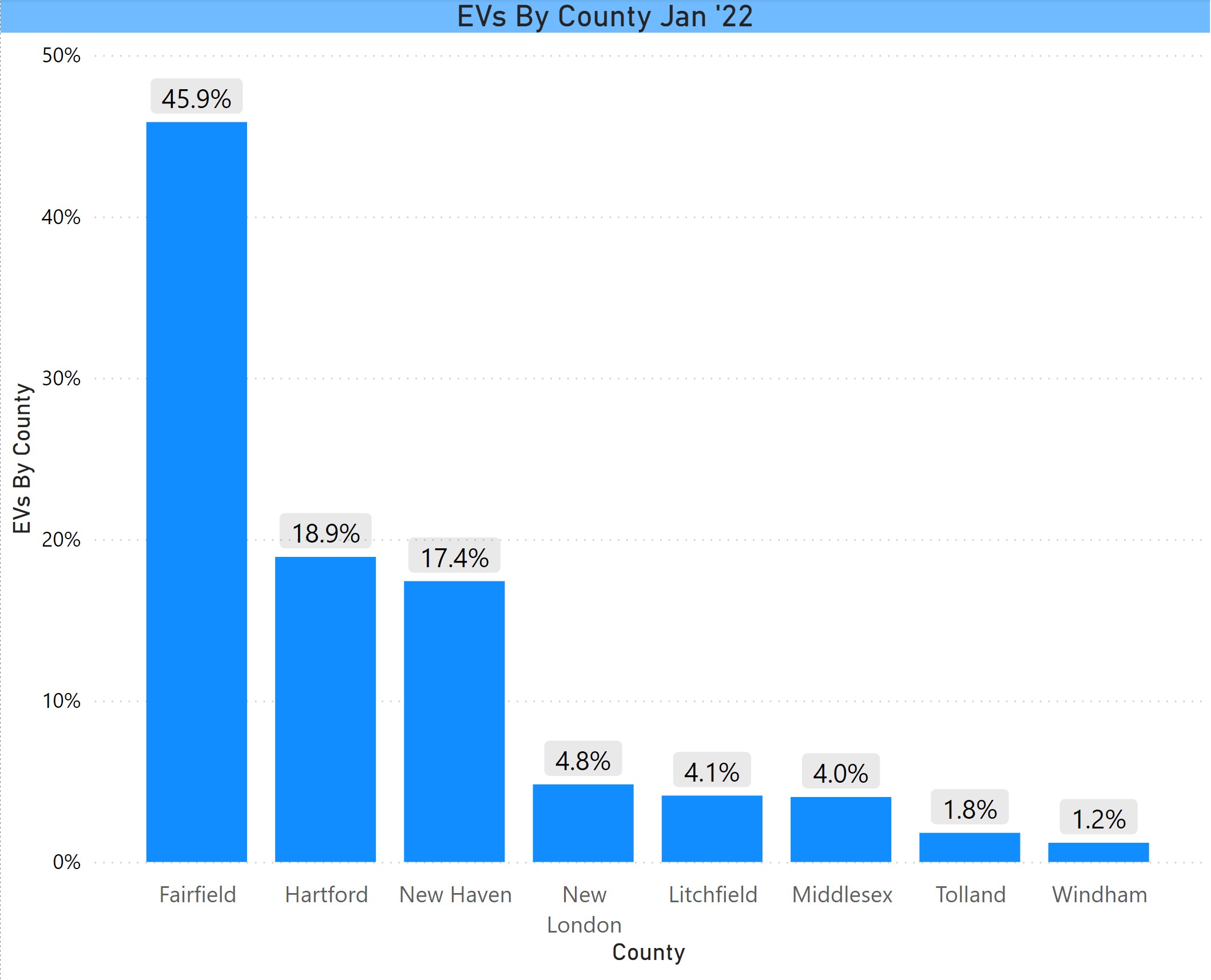
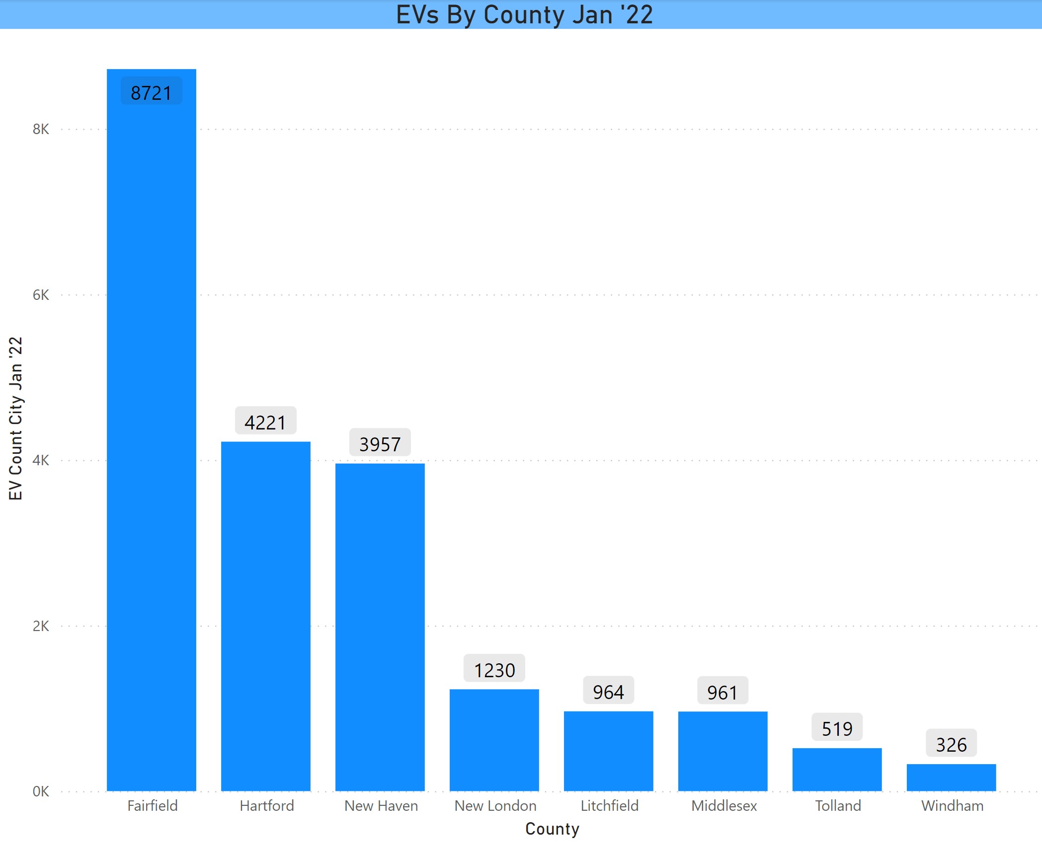
County

Fairfield County remains the EV epicenter with 40% of registered EVs. Hartford and New Haven County follow with Hartford slightly higher.
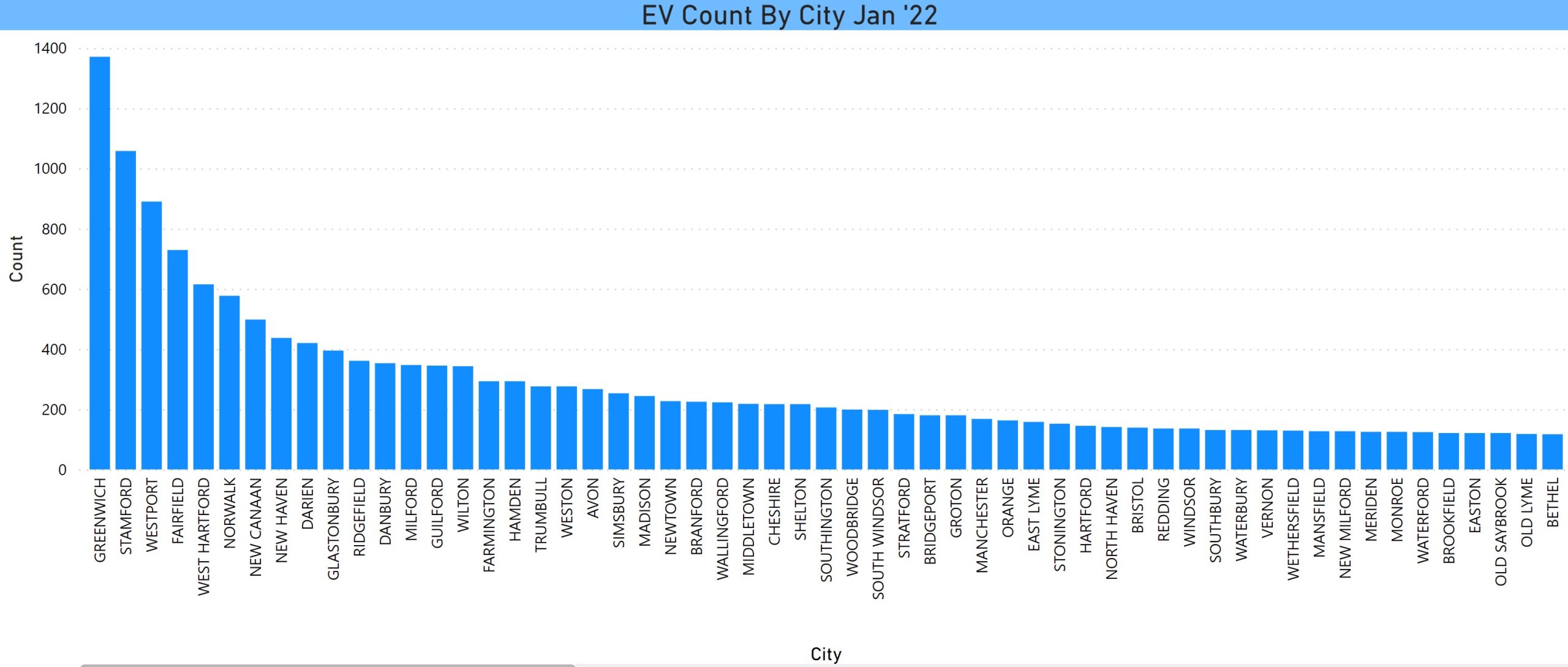
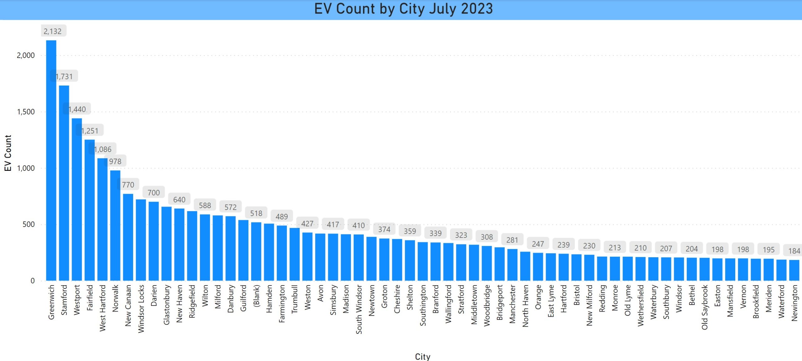
EVs by County July 2023

City

The top cities remain the same, except that Windsor Locks increased a lot to rank number 8. There is not enough room to display all of the cities or all of the data labels. If anyone would like to know the number for a particular city, please reach out to the EV Club.

EV Count by City

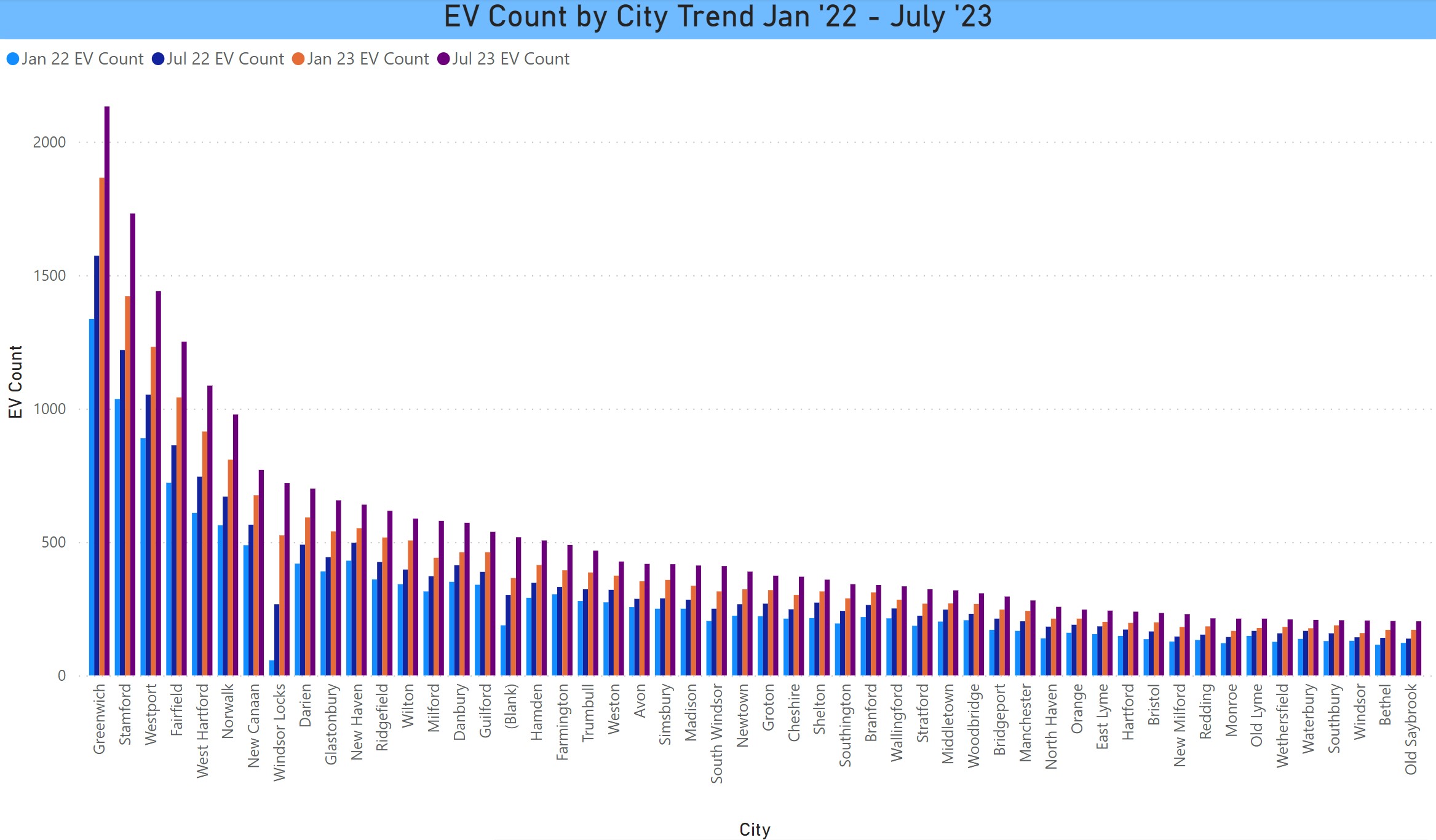
EV Count Trend by City

This is the trend for each city in 6-month intervals from January 2022 through July 2023.
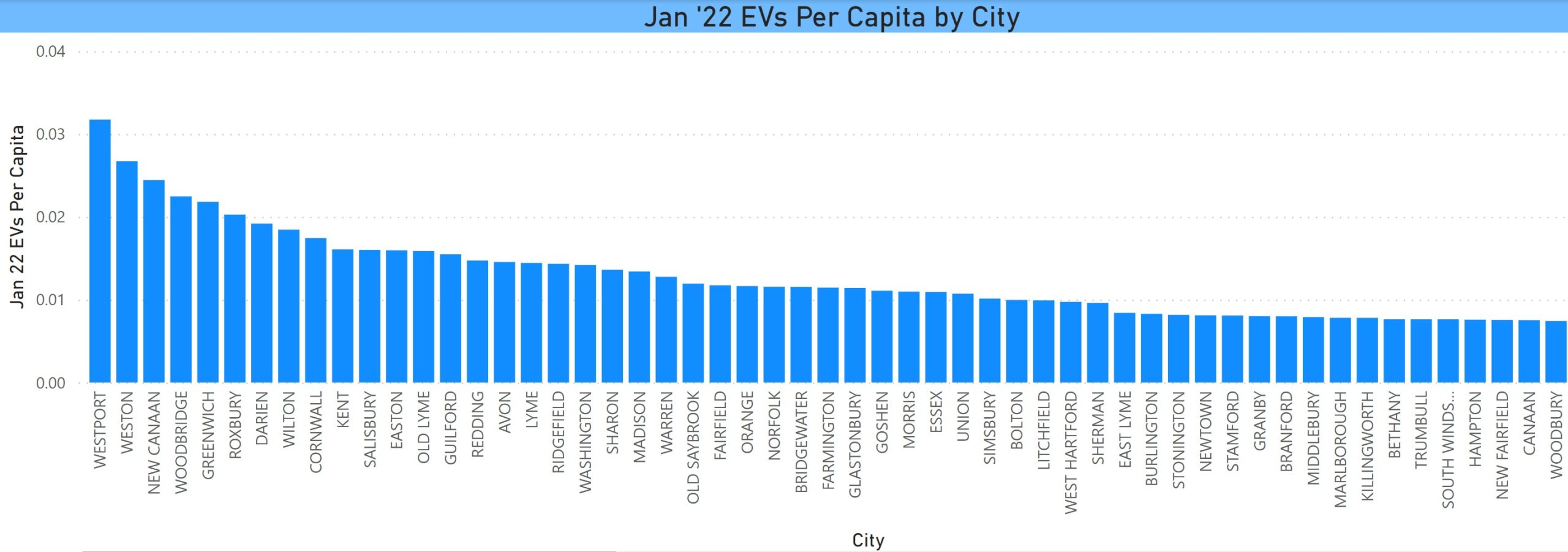
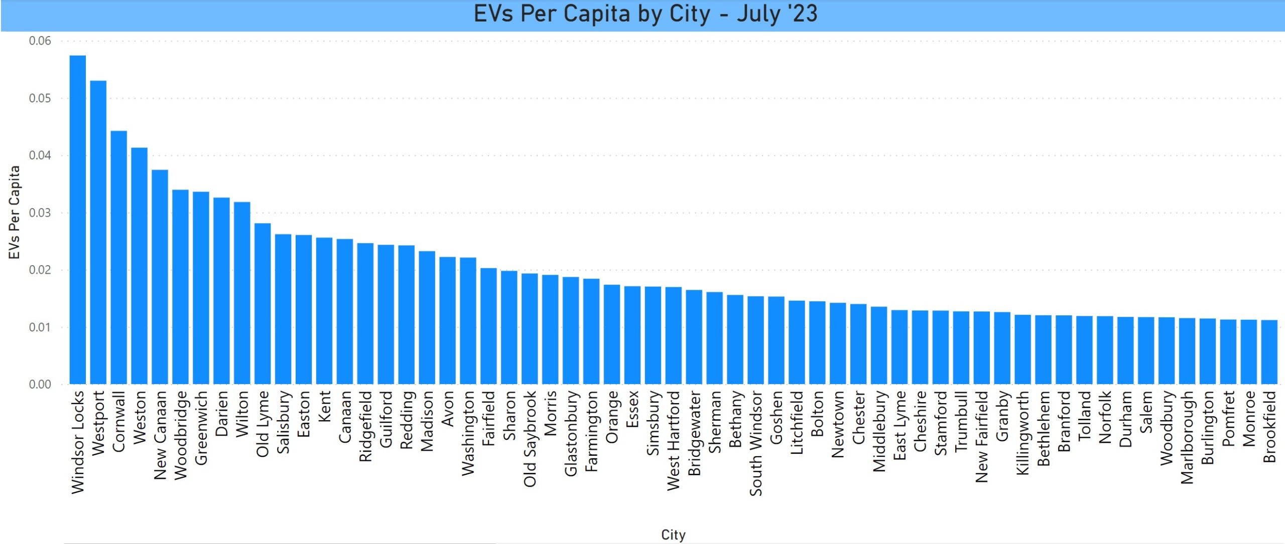
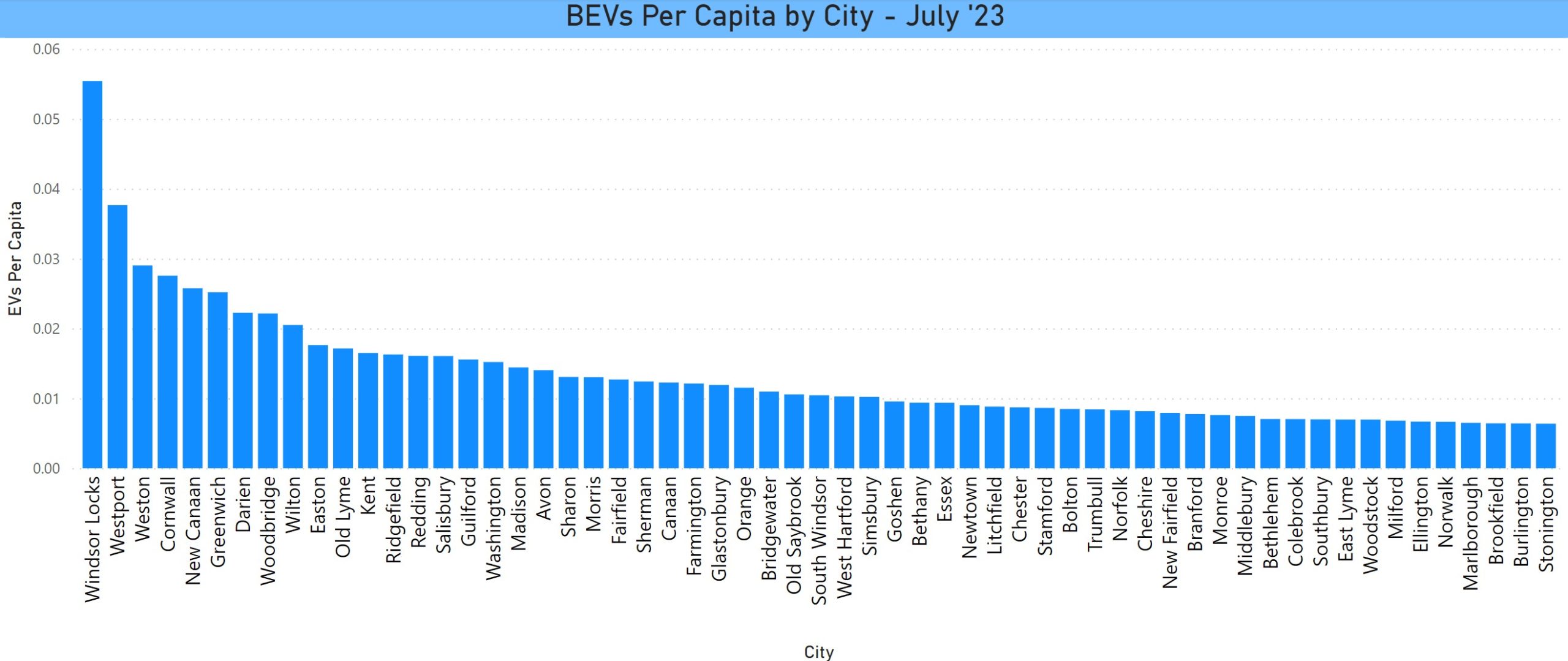
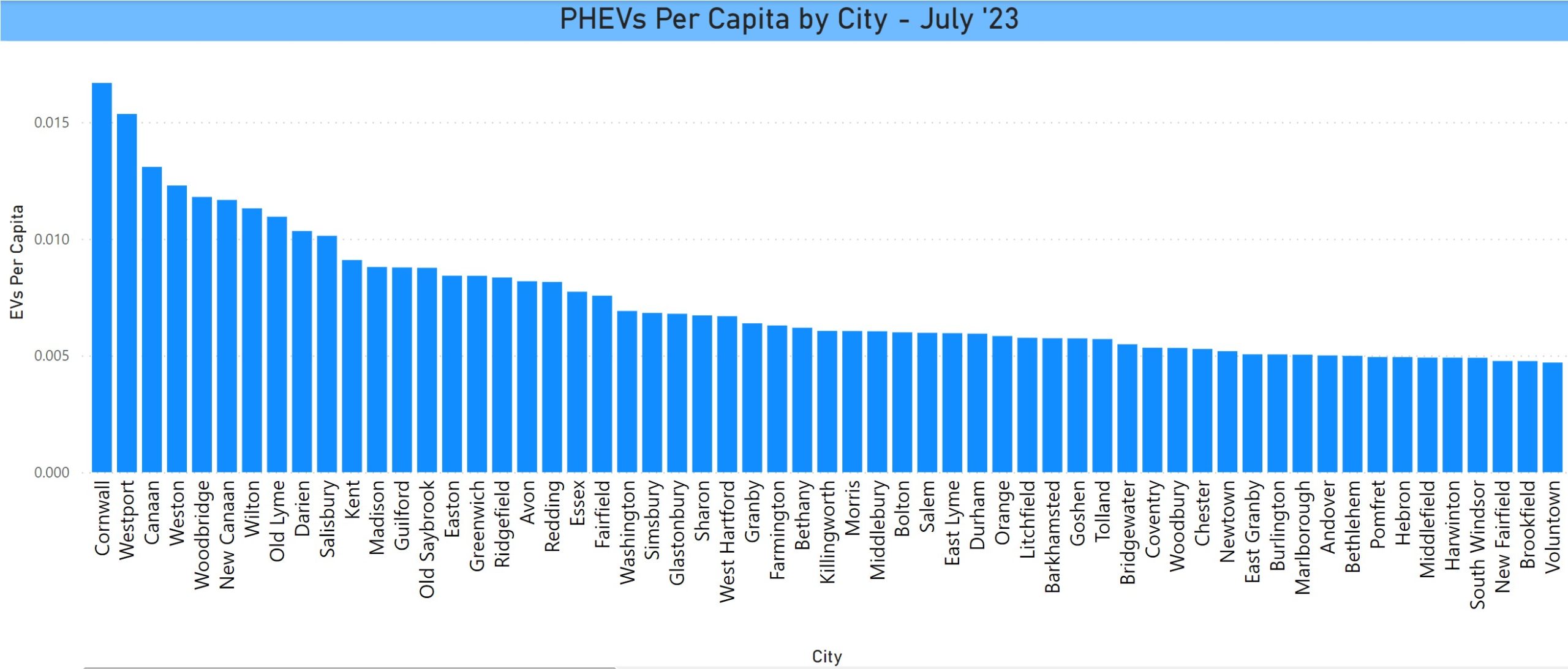
Trend of EVs by City Jan '22 - July '23

Per Capita

There is a change in the per capita rankings with Westport slipping to second, behind the smaller city of Windsor Locks, after being the leader since we started tracking these stats 7 years ago. Smaller cities dominate this ranking.

EVs per Capita by City July 2023

These are the per capita chart filtered for BEVs and PHEVs:

BEVs Per Capita by City in CT July 2023

PHEVs per capita by city in CT July 2023

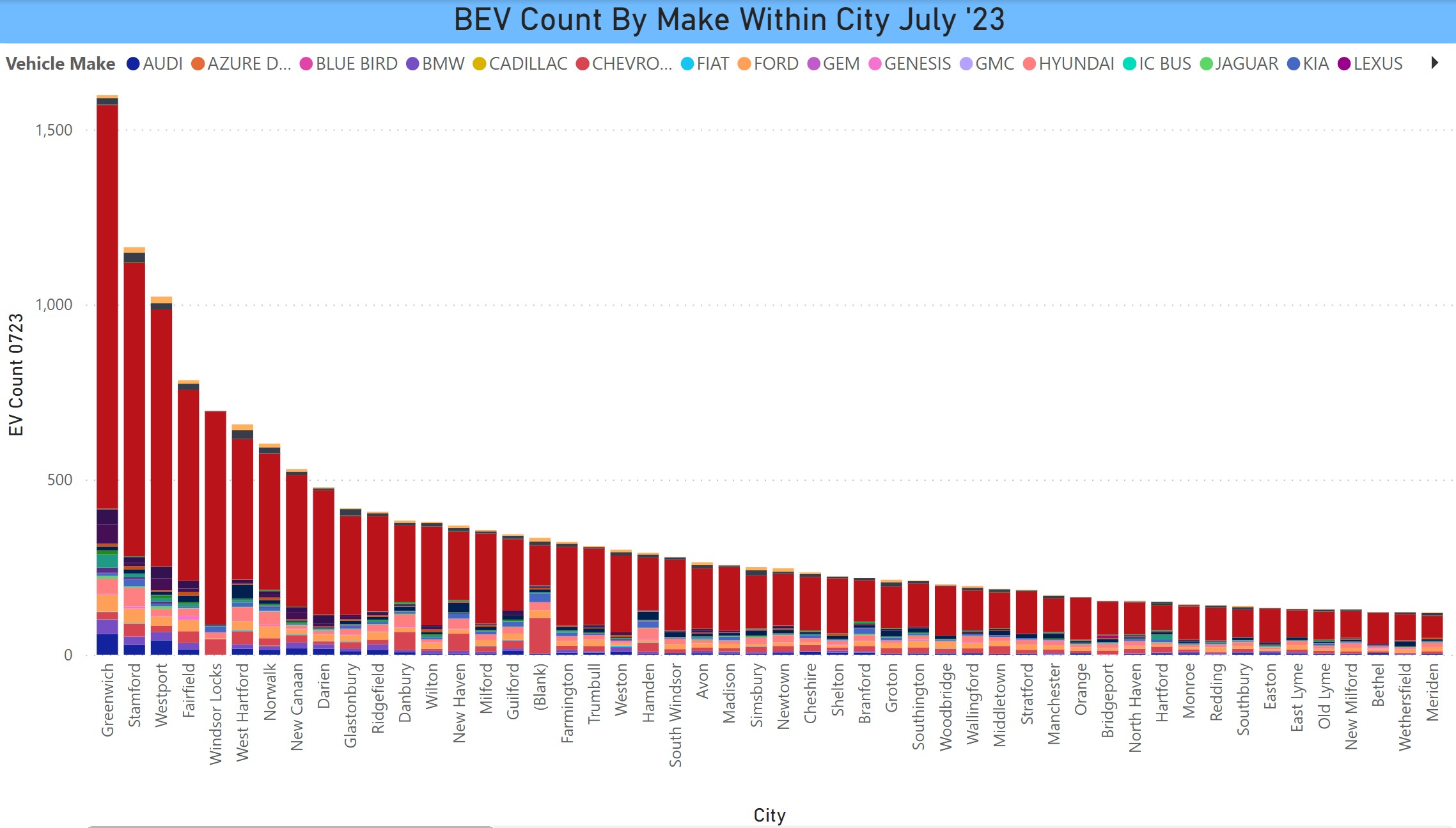
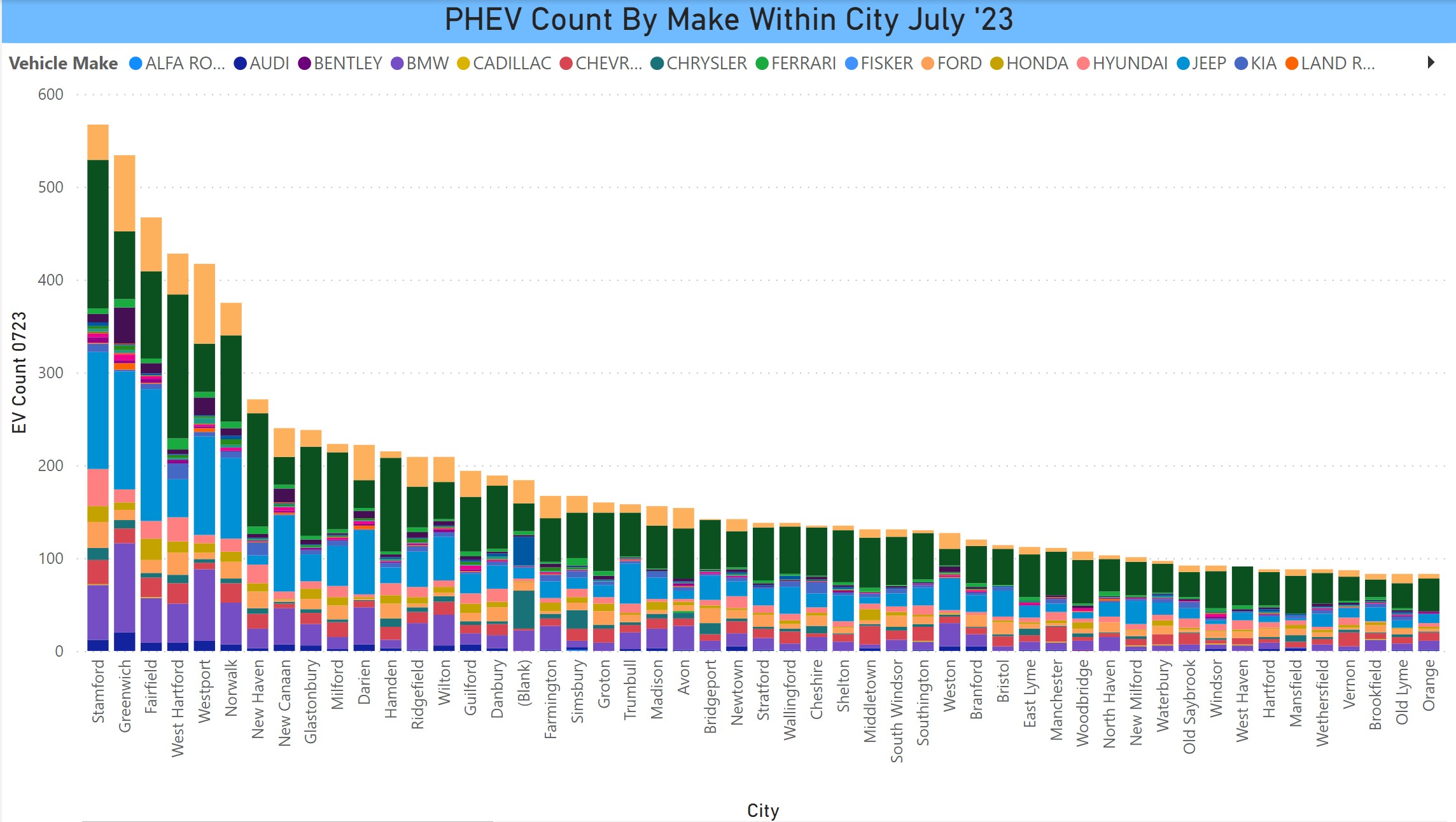
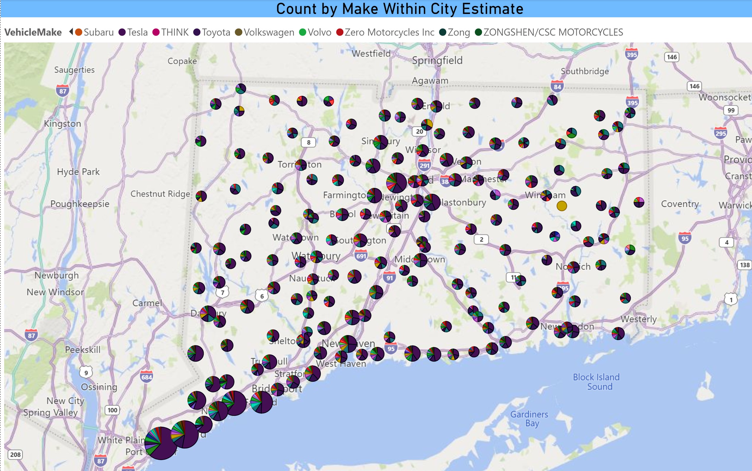
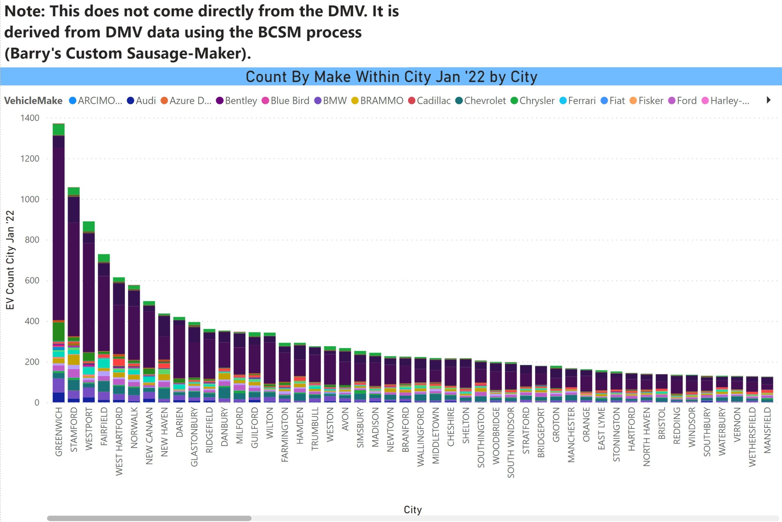
EV Count by Make within City

We are again able to track this. It is a dense chart that is complicated to see in a screen shot. At least it is colorful! Again, space is a limitation, both in the number of cities that can be displayed as well as the number of makes in the legend. The large red part of the bar is obviously Tesla. If anyone is looking for specific information, let us know. The chart itself displays some of the makes, but above the chart is all of the makes/colors.

Make Legend 1


Make Legend 2


Make Legend 3


EV Count by Make Within City July '23

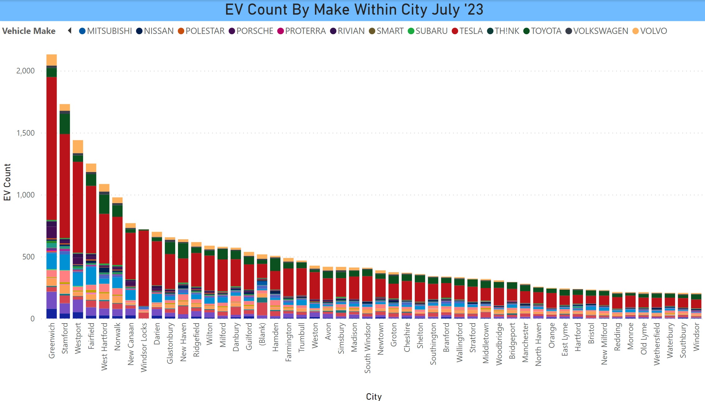
Below are two variations on the above chart – BEV by make within city and PHEV by make within city. It tracks more or less socio-economically with the BEV-heavy cities being the more affluent towns.

BEV Count by Make Within City July 2023

PHEV Count by Make Within City July 2023


Where The EVs are – Jan 2022 Edition

Barry Kresch

41% of CT EVs in Fairfield County

Hartford and New Haven Counties make up the bulk of the rest. When filtered for BEVs, there is even more of a Fairfield County skew.

% EVs by County in CT 1-22

% BEV by County

% battery electric vehicles by county in CT 1-22

In terms of raw numbers.

EVs by County in CT Jan 2022

EVs by City

In the map at the top of the post the bubbles are sized for the number of EVs in each city and the intensity of the color saturation deepens with higher EVs per capita. Below is a bar graph excerpt (due to space limitations of the cities with the highest EV count. Top cities are Greenwich (1371), Stamford (1058), Westport (890), Fairfield (729), and West Hartford (615).

EV Count by City in CT Jan 2022

EVs Per Capita by City

A number of the smaller cities, particularly in Fairfield County, rise higher in the ranks.

EVs per Capita by City in CT Jan 2022

Make Within City

DMV separates the geo from the vehicle data. Their reason is the 14-10 privacy regulations. I think it is a stretch that PII could be deduced from city level data, but the limitation exists, nonetheless. In this chart, I attempt to knit the files together and come up with estimates of EVs by make within city. I need to use the map format to fit every city on a web page. The bar chart displays the cities with the higher EV counts, along with my disclaimer.

Map of Estimated Count of EV Make by City in CT 1-22

Estimated Count of EV Make by City in CT Excerpt 1-22

Political Affiliation

This line on this chart is an overlay of EV count by city and the bars are the political affiliations of the voters within each city on a percentage basis (hence, the bars are the same size). There are percentages for Democrats (light blue), Republicans (dark blue), and minor party plus unaffiliated (orange). The minor party plus unaffiliated is mostly the latter. From the looks of this, there does not seem to be a strong correlation of EV ownership with political party, a good thing in our view. This is excerpted due to space limitations.


EV Count by City with Political Party Affiliation


EV Count and Median Income

This shows a much stronger correlation with income. The bars are cities sorted by median income and the line is EVs per capita (to normalize for population variation). This is also an excerpt due to space limitations. The full chart is on the dashboard.

The upper income skew is a challenge that needs to be addressed by manufacturers, EV advocates and policy makers. We want to see affordable EVs for all. Manufacturers need to serve this segment as well as the affluent. Policy makers can help with incentives and, importantly, taking steps to improve access to charging.

EV Count Per Capita and Median Income

Finally, this is the correlation between EV count by city and public chargers. The line chart displays L1, L2, L3, and the sum of all of them. Again, this is only an excerpt due to space limitations. There is a slider in the dashboard enabling one to display all cities. There is a correlation between EV count and lower numbers of public chargers. To some degree, it is masked in the larger cities where there might be clusters of chargers, L3 in particular, at service areas.

EV Count by City with Count of public chargers